Five things that drive local customers away from your site
Why local visitors leave without contacting you
You have a domain name, a hosting account, and a set of pages that describe what you do. People from your city land on the site, look around, and then leave without calling or filling in a form. That pattern repeats week after week. The problem is rarely that you lack a professional business website in the technical sense. More often, a handful of common mistakes stop visitors from taking the next step. Once you know what those mistakes look like, you can fix them yourself or ask a designer to adjust them.
The goal is a site that feels trustworthy and easy to use from the moment someone arrives. When a potential customer lands on your home page, they should see immediately what you offer, where you are, and how to get in touch. If any of those three pieces is missing or hard to find, the visitor clicks away. Below are the five most frequent problems that cost local enquiries, along with what to check on your own site.
1. A home page that buries the business details
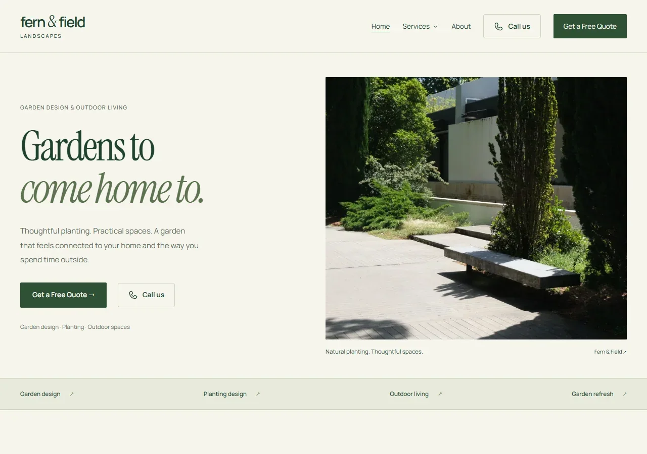
Your home page is the first thing most visitors see. If it leads with a large image, a vague slogan, or a long paragraph about your mission, the visitor has to hunt for the basics: your phone number, your physical address or service area, and your hours. That hunt takes only a few seconds before they decide you are not local or not open when they need you.
What to check: Look at your home page on a phone and on a desktop. Can you spot your phone number without scrolling? Is your suburb or city mentioned in the first screen of text? If the answers are no, move those details higher. A footer with contact info is fine for returning visitors, but first-time users need the essentials near the top.
Another common mistake is using a contact form as the only way to reach you. Forms are useful, but many people prefer to call. If your phone number is hidden behind a click or buried at the bottom of a page, you lose enquiries from people who want a quick conversation. Make the number visible on every page, ideally in the header.
2. Service pages that read like a brochure
Service pages are where you explain what you do and why someone should choose you. Too often, these pages list features and capabilities without connecting them to the reader's situation. A page that says "we offer commercial and residential services" does not tell a homeowner whether you handle their specific job or how quickly you can start.
What to check: Read each service page as if you know nothing about the business. Does it answer the questions a real customer would ask? What does the process look like? How long does it typically take? What happens after the work is done? If the page only states what you offer, without context or examples, rewrite it to address the reader's concerns directly.
Also check whether your service pages include your location. If you serve Auckland, say "Auckland" on the page, not just "the greater area" or "throughout the North Island." Local visitors want confirmation that you are nearby. Without that, they assume you are based elsewhere and might not respond quickly.
3. A contact form that asks for too much
The contact form is often the last step before a visitor becomes a lead. If the form asks for a phone number, an email address, a street address, a description of the problem, a preferred time, and a checkbox for marketing consent, many people will abandon it. Every extra field reduces the chance that someone completes the form.
What to check: Open your contact form on a phone. How many fields does it have? Can you submit it without entering anything except your name and a short message? If the form requires a phone number, consider making that field optional. Some people prefer to start with email and only give their number after they feel comfortable.
Also test whether the form sends a confirmation message or email. A form that appears to submit but gives no feedback leaves the visitor wondering whether their message arrived. A simple "thanks, we will be in touch" page or a short auto-reply email reassures them that you received it.

4. A mobile layout that makes simple tasks hard
More than half of local searches happen on a phone. If your site looks good on a desktop but forces a phone user to pinch, zoom, or tap tiny links, you are turning away a large portion of your potential customers. A mobile layout is not just a smaller version of the desktop site. It should rearrange content so that the most important actions - calling, emailing, finding the address - are easy to do with a thumb.
What to check: Load your site on an actual phone, not just a browser's resize tool. Try to tap your phone number. Does it trigger a call? Try to tap an email address. Does it open the email app? Try to fill in the contact form. Are the text fields large enough to type into without zooming? If any of these actions is awkward, your mobile layout needs work.
Also check whether your site uses a font size that is readable on a small screen. Tiny text forces the user to zoom, and after zooming they have to scroll sideways to read the full line. That friction makes them leave. A minimum font size of 16 pixels for body text is a safe starting point.
5. A call to action that is unclear or missing
A call to action tells the visitor what to do next. It might be "call now," "book online," "get a quote," or "visit our showroom." Without a clear next step, the visitor reads the page and then leaves because they do not know what you want them to do. Even worse, some pages have multiple calls to action that compete with each other, leaving the visitor unsure which one matters most.
What to check: On every page, identify the single most important action you want a visitor to take. Is it a phone call? A form submission? A visit to a specific location? Once you know that action, make it prominent. Use a button or a link that stands out visually, and place it near the top of the page and again near the bottom. Remove or de-emphasise any other action that might distract from the primary one.
Also check the language of your call to action. Vague phrases like "learn more" or "get started" do not tell the visitor what will happen. Specific phrases like "get a free quote" or "book a consultation" set clear expectations and feel more trustworthy. When the visitor knows exactly what they are signing up for, they are more likely to click.
Putting it all together: what a site that works looks like
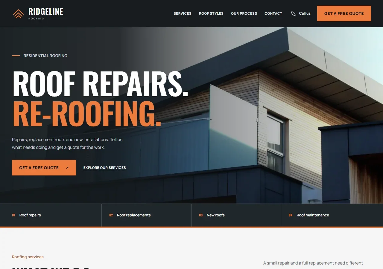
When you fix these five issues, your site starts to feel like a website ready for customers. The home page shows your location and phone number without scrolling. The service pages answer the questions a real customer would ask. The contact form asks only for the essentials and confirms receipt. The mobile layout lets someone call or email with one tap. And every page has a clear, specific call to action that tells the visitor what to do next.
None of these fixes requires a complete redesign. Most are adjustments to layout, content, or form fields that you can make in an afternoon. The payoff is that more of the people who land on your site will actually reach out, because the path from arrival to enquiry is smooth and obvious. That is what turns a site that just sits there into a website ready for customers.